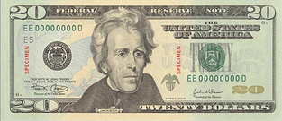
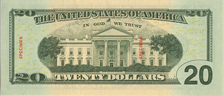
American Paper Currency is Ugly. It always has been, and apparently always will be. Yes, the new bills that have some color in them are nice, but, they’re still ugly. Compare a US $20 bill…


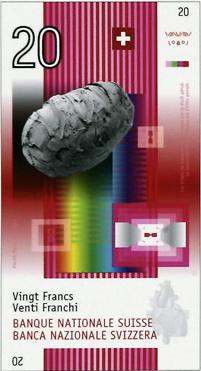
… with the newly selected design of the Swiss 20 franc note…

 .
.
Your honor, the prosecution rests.
I mean, seriously. Look at it! It’s pretty! I’d want to have them in my wallet. Hell, I’ve been trying to score a £20 note for years simply because it’s music themed. Some of the other new francs have images of a embryo, the AIDS virus, and a skull. They’re all very colorful, contain a ton of security measures (including microperfs, small holes in the paper), color shifting ink, two-toned ultraviolet reactions, and more.
I know it’s a pipe dream that the US will jump on the neat currency bandwagon, less the world shudder like when the US announced a new $100 bill design. Until then, I’ll continue to pine for cooler currency
(via BoingBoing)